

Ethics of genetic data
Do now
Debate whether genetic test results should be shared with relatives, and defend your view.
- Hand in
- Written CER (3-5 sentences) arguing whether genetic test results should be shared with relatives, with a reference to the shared nature of genetic information in the reasoning.
- Where
- Turn this in at the drop folder with your district Microsoft sign-in, or hand it to Mr. Mendoza in class. Both count as submitted. Doing the activity in myPLTW does not.
You get two school days for every day you were absent, so this deadline moves with you.
If your DNA test reveals a serious inherited risk, do your parents, siblings, and children have a right to be told, even if you say no?
Debate whether genetic test results should be shared with relatives, and defend your view.
- • I can weigh genetic privacy against relatives' interests.
- • I can defend a position with reasoning.
- Name one piece of medical information about you that is also, in part, information about a blood relative.
- If a test told you that you would likely get a serious but preventable disease at 40, would you want to know? Why or why not?
- 1Read the prompt: If your DNA reveals a risk, do relatives have a right to know?
- 2List one argument for disclosure and one for individual privacy.
- 3Choose a side and connect it to shared genetic information.
- 4Argue your claim in your group with one reason and one example.
- 5Post a written CER with your position and reasoning.
What did this day actually feel like?
Ethics of genetic data
ETHICS DAY If your DNA reveals a risk, do your relatives have a right to know? Genetic information is strange because it is partly shared. A result about me is partly a result about you.
This was the hardest Monday so far and the first one that felt personal rather than academic. I argued for individual privacy and then had to sit with the fact that under my own rule, someone could learn they carry something serious and say nothing to a sibling who could act on it. I did not resolve it. My CER says so, and Mr.
Mendoza said an honest unresolved position beats a tidy fake one.
AT HOME, THE NIGHT BEFORE WED OCT 21 DNA, genes, and protein DNA structure, chromosomes, genes, then the central dogma: DNA to RNA to protein, by transcription and translation. Then how a mutation changes a protein and can cause disease.
I built the pre-lab mutation plan for tomorrow: a nine-base template, the mRNA it transcribes to, the amino acids it translates to, and the point mutation I planned to introduce. Doing it on paper first meant tomorrow was checking my work rather than guessing.
Turned in: pre-lab mutation plan → recorded in Class Records
Fiction. There is no such student. The lessons, labs and dates are the real planned course; the student, the classmates and the conversations are invented.
The same day, drawn.
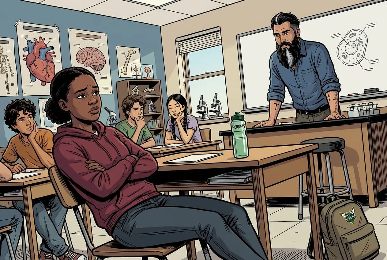
If your DNA reveals a risk, do your relatives have a right to know? A result about me is partly a result about you. Hardest Monday yet.
MR. MENDOZA
An honest unresolved position beats a tidy fake one.
Fiction. There is no such student. The lessons, labs and dates are the real planned course; the student, the classmates and the conversations are invented.
🛠 Get unstuck · pick your level
🔑 Today's words · 5
Tap a word in the lesson for a plain meaning and one example. Recycled into next week's Do-Now.
Do the work · 80-minute blockfirst 5 min = hook▸
💡 Big idea: A genetic result is partly shared with relatives, so deciding who may see it is an ethical problem that ordinary private lab tests never create.
- 0:00Hook: brief description of a real case where a patient refused to share a hereditary result with their family
- 0:10Introduce GINA; contrast genetic privacy with the concept of shared genetic heritage
- 0:20Read the ethics prompt; list one argument for disclosure and one for individual privacy
- 0:32Small-group debate: connect position to the nature of shared genetic information
- 0:54Individual CER writing: position, evidence, reasoning
- 1:10Share two CERs; preview Tuesday DNA-to- content
- • A genetic test is different from any other medical test in one crucial way: your DNA is shared with your biological family. If a test reveals you carry a BRCA gene variant linked to breast , your sister may carry it too.
- • The question today is: does your sister have a right to know? And does your doctor have an obligation to tell her?
- • Legally, in most places, the answer is no. Your genetic information belongs to you. But ethically, the question is genuinely contested. Relatives who could take preventive action and are not told might argue later that they deserved to know.
- • Pick a side and defend it. Wednesday we move from ethics to mechanism: how does DNA actually make a , and what happens when it goes wrong?
- • GINA (Genetic Information Nondiscrimination Act) prohibits discrimination in health insurance and employment based on genetic information, but does not require disclosure to relatives.
- • A patient's information may have medical relevance for first-degree relatives (parents, siblings, children), creating a tension between individual privacy and family benefit.
- • Genetic counselors are healthcare professionals who help individuals and families understand and navigate the implications of genetic test results.
Unit 2.2 Decoding a Diagnosis: DNA, chromosomes, genes, proteins, protein synthesis, mutation, inheritance. · Ethics of genetic data
Day 1 of this lesson. Open this exact section in myPLTW (find it in Clever, Microsoft sign-in), then do the work below.
Do this: Log in to myPLTW and open Lesson 2.2 Decoding a Diagnosis. Read the unit overview before Tuesday.
Mark the Lesson 2.2 overview task complete in myPLTW.
You finished the clinical-data work last week. Today starts Lesson 2.2 Decoding a Diagnosis (DNA and focus). The overview reading should be done by the end of today.
myPLTW screenshot showing the Lesson 2.2 Decoding a Diagnosis overview task marked complete.
The official PLTW activity stays inside myPLTW. If myPLTW will not open, use F1 and E1-E3 on this page to complete today's local evidence decision, then make up the official activity when access returns. Turn this in at the drop folder with your district Microsoft sign-in, or hand it to Mr. Mendoza in class. Both count as submitted. Doing the activity in myPLTW does not.
Check things off as you work, then submit. This tells Mr. Mendoza how you're doing so he can help the class. It does not replace turning in your producible through the submission route shown below.
Use the code Mr. Mendoza gave you, not your name. Saved on this device.
Unit 2.2 Decoding a Diagnosis: DNA, chromosomes, genes, proteins, protein synthesis, mutation, inheritance. · Ethics of genetic data
Log in to myPLTW and open Lesson 2.2 Decoding a Diagnosis. Read the unit overview before Tuesday.
You finished the clinical-data work last week. Today starts Lesson 2.2 Decoding a Diagnosis (DNA and focus). The overview reading should be done by the end of today.
This is how Mr. Mendoza sees the class keeping pace with PLTW. Be honest, it only helps if it is accurate.
🎯 Debate whether genetic test results should be shared with relatives, and defend your view.
- Read the prompt: If your DNA reveals a risk, do relatives have a right to know?
- List one argument for disclosure and one for individual privacy.
- Choose a side and connect it to shared genetic information.
- Argue your claim in your group with one reason and one example.
- Post a written CER with your position and reasoning.
CER: Written CER (3-5 sentences) arguing whether genetic test results should be shared with relatives, with a reference to the shared nature of genetic information in the reasoning.
Turn this in at the drop folder with your district Microsoft sign-in, or hand it to Mr. Mendoza in class. Both count as submitted. Doing the activity in myPLTW does not. Use the checklist just below and upload by 11:29 PM for full credit. Absent with an excused absence? You get two school days for every day you were absent, so this deadline moves with you.
| Task | Who |
|---|---|
| Read the prompt: If your DNA reveals a risk, do relatives have a right to know? | _______ |
| List one argument for disclosure and one for individual privacy. | _______ |
| Choose a side and connect it to shared genetic information. | _______ |
| Argue your claim in your group with one reason and one example. | _______ |
| Post a written CER with your position and reasoning. | _______ |
Working solo? Put your own name in "Who" for every row.
- I can weigh genetic privacy against relatives' interests.
- I can defend a position with reasoning.
- 1Do thisDebate whether genetic test results should be shared with relatives, and defend your view.
- 2Use this resource
- 3Submit thisCER: Written CER (3-5 sentences) arguing whether genetic test results should be shared with relatives, with a reference to the shared nature of genetic information in the reasoning.
- 4Submit it here
- 1Open the drop folder.
- 2Sign in with your district Microsoft account, not a personal one.
- 3Upload the file, named Lastname_Firstname__Assignment Title.
- 4Your own upload panel says Uploaded with a green check: that is your receipt.
Turn this in at the drop folder with your district Microsoft sign-in, or hand it to Mr. Mendoza in class. Both count as submitted. Doing the activity in myPLTW does not. Principles of Biomedical Technology (Principles of Biomedical Science) › Unit 2.2 Decoding a Diagnosis: DNA, chromosomes, genes, proteins, protein synthesis, mutation, inheritance. › CEROpen the drop folder
Learn it · deck, reading, and vocabulary▸
The deck carries the prior idea forward, lets you inspect an analogy, maps the rule to biology, and ends with the same evidence decision and exit ticket used on this page.
Generated from this lesson's canonical data with a red-team citation check.
A trend describes direction, speed, and position relative to the , so reading the trend rather than any single value tells you whether a chronic condition is improving or worsening, because one reading can be distorted by a meal, stress, or lab error.
A genetic result is partly shared with relatives, so deciding who may see it is an ethical problem that ordinary private lab tests never create.
A smoke alarm detects signs of fire but can also react to burnt toast.
- What does the alarm detect?
- What creates a false alarm?
- What evidence is needed before declaring a fire?
A screening signal changes what to investigate next; it does not automatically prove the cause.
Biomedical tests have measured performance and biological sampling limits that a household alarm does not capture.
- • Alarm signal maps to a test result.
- • Burnt toast maps to a .
- • Inspection maps to confirmation or the next test.
Driving question: If your DNA test reveals a serious inherited risk, do your parents, siblings, and children have a right to be told, even if you say no?
What you already know: A trend describes direction, speed, and position relative to the , so reading the trend rather than any single value tells you whether a chronic condition is improving or worsening, because one reading can be distorted by a meal, stress, or lab error.
New idea: A genetic result is partly shared with relatives, so deciding who may see it is an ethical problem that ordinary private lab tests never create.
Visual or model: F1. F1. A lesson illustration or teaching diagram for Ethics of genetic data. Use it with E1-E3; it is a model or context image, not experimental or patient data. What to notice: Trace the labeled observation or evidence sequence before choosing an explanation.
- Observe or measure the relevant feature in Ethics of genetic data.
- Organize the observation with a stable evidence ID.
- Apply this rule: A screening signal changes what to investigate next; it does not automatically prove the cause.
- Choose the option the evidence supports and state the limit of the conclusion.
Real biomedical example: If your DNA test reveals a serious inherited risk, do your parents, siblings, and children have a right to be told, even if you say no?
What the evidence supports: E1-E3 and F1 support the daily take-home when the response meets the stated success criteria.
What it cannot prove: The package does not support claims beyond this lesson's or any real patient diagnosis.
- • DNA: The molecule that stores genetic instructions in a twisted double helix, with paired bases that spell out the code for building an organism.
- • : A tightly coiled package of DNA wrapped around proteins that carries genes; humans normally have 46 of them, arranged in 23 pairs.
- • gene: A stretch of DNA that codes for a product (usually a ) and carries an instruction for the cell.
- • : One of the alternative versions of a gene found at the same spot on a , like the blue or brown options for eye color.
- • : A folded chain of amino acids that a gene's instructions are used to build, serving as the cell's machines and structural building blocks.
- • : The first step of making a : copying a DNA gene into messenger RNA.
- • : The second step of making a : the ribosome reads the mRNA and builds a chain of amino acids.
- • : A change in the ; some change a enough to cause disease, many do not.
Use it now: Choose one decision option. Cite E1 and E3, then explain how the rule connects the evidence to your choice.
Go further, optional: The source links below are optional enrichment. Every fact required for today's local evidence decision appears in this lesson package.
GINA (Genetic Information Nondiscrimination Act) prohibits discrimination in health insurance and employment based on genetic information, but does not require disclosure to relatives.
Limit: E1 supplies context or an observation; it does not by itself establish the explanation.
A genetic result is partly shared with relatives, so deciding who may see it is an ethical problem that ordinary private lab tests never create.
Limit: E2 is a teaching statement or comparison and must be checked against the task evidence.
I can weigh genetic privacy against relatives' interests.
Limit: E3 supports only the result or product criterion named here; it cannot justify a broader clinical or causal claim.
PLTW-PBT-2026-10-20 · Simulated classroom evidence scenario
Your role: biomedical investigator
Decision: Your team must decide what the evidence from Ethics of genetic data supports before submitting the claim-evidence-reasoning response named on the lesson page.
- • Choose the strongest supported explanation.
- • Choose the next evidence to collect.
- • Hold the decision because the evidence is insufficient.
Response: State one choice, cite at least two evidence IDs, explain the rule that connects them, and add one limitation. Submit it as the claim-evidence-reasoning response.
Claim ceiling: The supplied lesson evidence can support an observation, pattern, classroom mechanism, or next-step decision about Ethics of genetic data. It cannot by itself prove causation, establish a real clinical diagnosis, or justify action outside this classroom task.
Reason for review: Your team must decide what the evidence from Ethics of genetic data supports before submitting the claim-evidence-reasoning response named on the lesson page.
Context: A genetic result is never only about one person, so the ethics of who sees it are different from the ethics of any other lab test.
- • T1: Read the prompt: If your DNA reveals a risk, do relatives have a right to know?
- • T2: List one argument for disclosure and one for individual privacy.
- • T3: Choose a side and connect it to shared genetic information.
- • T4: Argue your claim in your group with one reason and one example.
- • T5: Post a written CER with your position and reasoning.
- • E1: GINA (Genetic Information Nondiscrimination Act) prohibits discrimination in health insurance and employment based on genetic information, but does not require disclosure to relatives.
- • E2: A genetic result is partly shared with relatives, so deciding who may see it is an ethical problem that ordinary private lab tests never create.
- • E3: I can weigh genetic privacy against relatives' interests.
Measurements: Use only the measurements, units, graph, or counts supplied in today's task. No additional patient measurement is implied.
Figure finding: Teaching diagram for Ethics of genetic data. Trace the labeled observation or evidence sequence before choosing an explanation. This is a teaching model, not patient or experimental data.
Uncertainty: This is a composite classroom scenario. Missing history, measurements, or confirmation tests remain unknown and limit the conclusion.
Mean = sum of values / number of values. Median = middle ordered value. Range = maximum - minimum.
For 2, 4, 4, and 10: mean = 20 / 4 = 5, median = 4, and range = 10 - 2 = 8.
Mean, median, and range keep the measurement unit. Order the values before finding the median.
Calculate the requested summary for today's supplied values, then write what it reveals and what it hides.
Students often think Students often assume your medical records are 100 percent private, so a genetic result is yours alone to keep or share.. The trap: The trap is treating DNA like a blood-sugar reading. Your sequence is half-shared with each parent, sibling, and child, so a result about you is a partial result about them, which is exactly why the privacy question is so hard.
Parallel scenario (a model, not today's answer): A person tests positive for a serious sexually transmitted infection such as HIV. Should their past partners be told, even if the patient would prefer that no one is contacted?
Claim: A patient who tests positive for a serious sexually transmitted infection should be strongly encouraged to allow past partners to be notified, and public health should offer confidential partner notification, but the patient should not be publicly named without their consent.
Evidence: Infection information is partly relational, because a positive result also points to a risk that specific past partners may already be infected and not know it. Many U.S. states run confidential partner notification programs in which a health worker contacts partners without revealing the patient's name. Laws protect people who test positive from certain kinds of discrimination, but those protections do not, by themselves, require a patient to personally tell every partner.
Reasoning: Because the risk is shared, past partners could benefit medically from learning they should be tested and, if needed, treated early, which supports notification. At the same time, the result is sensitive personal health information, so privacy and autonomy support letting the patient control how their own name is used. The balanced position uses confidential partner notification, which lets partners learn their risk while shielding the patient's identity, so both the health benefit to others and the patient's privacy are respected rather than one being sacrificed for the other.
This model shows the level of evidence and organization needed to complete: A short written argument, modeled on a parallel scenario, that takes a side on whether a patient who tests positive for a serious infectious disease should have past partners notified, with reasoning that weighs relational health information against patient privacy. It models the Claim, Evidence, Reasoning format and depth without answering today's genetic-data prompt.
- Write one defensible claim.
- Choose specific evidence that supports the claim.
- Explain the scientific rule that connects the evidence to the claim.
Keep the structure. Replace the question, facts, measurements, and evidence. Then recheck units, vocabulary, and whether the conclusion goes beyond the evidence.
Also due today: Post the CER to the discussion board or hand in the written copy before leaving.
- CER:
- Claim, Evidence, Reasoning: make a claim, back it with evidence, explain your reasoning.
- SOP:
- Standard Operating Procedure, the exact steps to follow (especially in a lab).
- Tracker:
- Your PLTW progress log where you record completed evidence.
- myPLTW:
- The PLTW course site where you do the online activities. Find it in Clever with your Microsoft sign-in, right next to Schoology.
Tap the speaker to hear a term. Add two of these to your notebook glossary with a definition and an example in your own words.
Pick just 2 or 3 words from today and make them yours: write what each one means in your own words, name the context clue or evidence that helped, then give one example from what you actually did in Ethics of genetic data. Try your own words first; the glossary is there if you get stuck. This is voluntary and counts as extra credit, so keep it short.
Saved on this device. Show Mr. Mendoza or add these to your notebook glossary to claim the extra credit.
Hand-picked readings and interactives for this lesson, from authoritative open organizations and PLTW's own public course outline.
Check yourself · commit, then reveal▸
Claim ceiling for this check: The supplied lesson evidence can support an observation, pattern, classroom mechanism, or next-step decision about Ethics of genetic data. It cannot by itself prove causation, establish a real clinical diagnosis, or justify action outside this classroom task.
Aisha's genetic test shows a variant tied to a preventable heart condition. Her brother refuses to hear anything about her results. Name one reason this situation is ethically harder than a normal private lab test.
Write an answer and pick a confidence to unlock the key.
Fast retrieval with instant answers, not the commit-then-reveal check above. Try each from memory first: write what you remember about the earlier units, then check yourself here.
Go further and get help▸
What today's skills lead to. These are real health-science careers this course builds toward. Tap one to see, on the US Department of Labor's O*NET site, what the job actually involves, what it pays, and how fast it is growing.
Watch the recorded genetic-data ethics prompt and post a written CER on whether results should be shared with relatives.
John Carroll Philosophy for ChildrenThen submit your CER. Turn this in at the drop folder with your district Microsoft sign-in, or hand it to Mr. Mendoza in class. Both count as submitted. Doing the activity in myPLTW does not.
Class still runs. Complete the online activity above (it's self-guided). Need the concept taught without a teacher? Use this authoritative explainer:
Learn.Genetics (University of Utah): DNA to protein- CompleteEvery required part of the artifact is present, nothing left blank.
- AccurateThe science and the data are correct and match the evidence.
- Scientific reasoningYou explain your claim with evidence and reasoning (CER), not just an answer.
- Professional communicationClear, organized, labeled, and written the way a clinician or scientist would.
- SubmittedTurned in the right way, on the class site or handed to Mr. Mendoza in class, and confirmed. Not in Schoology: that is where the report-card grade appears later.