

Graphing and statistics
Safety gate · before any work
- Wear the required PPE, keep the bench clear, handle equipment only as directed, and know where the eyewash, sink, and spill kit are before you start.
- Human samples and data stay private: label with a code, never a name, and dispose of materials in the correct waste container, then wash your hands.
Do now
Build a graph from collected data and compute descriptive statistics to summarize a sample.
- Hand in
- Data table with three trials and units, calculations of mean/median/range/SD, a correctly labeled graph, and a 3-sentence CER explaining what the standard deviation reveals about precision.
- Where
- Turn this in at the drop folder with your district Microsoft sign-in, or hand it to Mr. Mendoza in class. Both count as submitted. Doing the activity in myPLTW does not.
You get two school days for every day you were absent, so this deadline moves with you.
You have thirty measurements and someone asks, so what does the data say? What do you compute and draw so your answer is defensible, not just an impression?
Build a graph from collected data and compute to summarize a sample.
- • I can compute mean, range, and .
- • I can pick and label a graph that fits my data type.
- If two students both scored an average of 80, could their results still be very different? How?
- What does a graph show you that a table of numbers hides?
- 1Enter Wednesday's measurements into a with labeled units.
- 2Calculate mean, median, range, and for your sample.
- 3Choose an appropriate graph type and plot the data with titled axes.
- 4Write a CER: what does the spread of data tell you about precision?
- 5Identify one limitation that the reveals about your method.
What did this day actually feel like?
Graphing and statistics
We took Wednesday's measurements and turned them into something defensible. Mean, median, range, standard deviation, then a graph with the axes actually labeled and units on them.
The thing that stuck: he showed two data sets with the same average that told completely different stories, because one was tightly clustered and one was all over the place. The average hid it. The spread revealed it. I had never thought of standard deviation as anything but a formula before, and now it is the number that tells you whether to trust the average.
My struggle today was the standard deviation calculation. I got it wrong twice because I was squaring after summing instead of before. A girl at my table walked me through it on scratch paper and it finally clicked.
AT HOME, THE WEEKEND BEFORE TUE SEP 8 Submit launch evidence Friday is packet day. Everything from the week goes in together: signed safety contract, the SDS card, the notebook SOP page, the data table with statistics, the graph.
He compared it to forensics, where a missing signature or one undocumented step can get otherwise perfect evidence thrown out of court. The tracker works the same way. Everything has a place and a missing piece is a missing piece regardless of how good the rest is.
I was missing the SDS card. I had done it, I just never uploaded it. Took two minutes to fix once I noticed, and I would not have noticed without the checklist.
Turned in: full week packet → recorded in Class Records
Fiction. There is no such student. The lessons, labs and dates are the real planned course; the student, the classmates and the conversations are invented.
The same day, drawn.
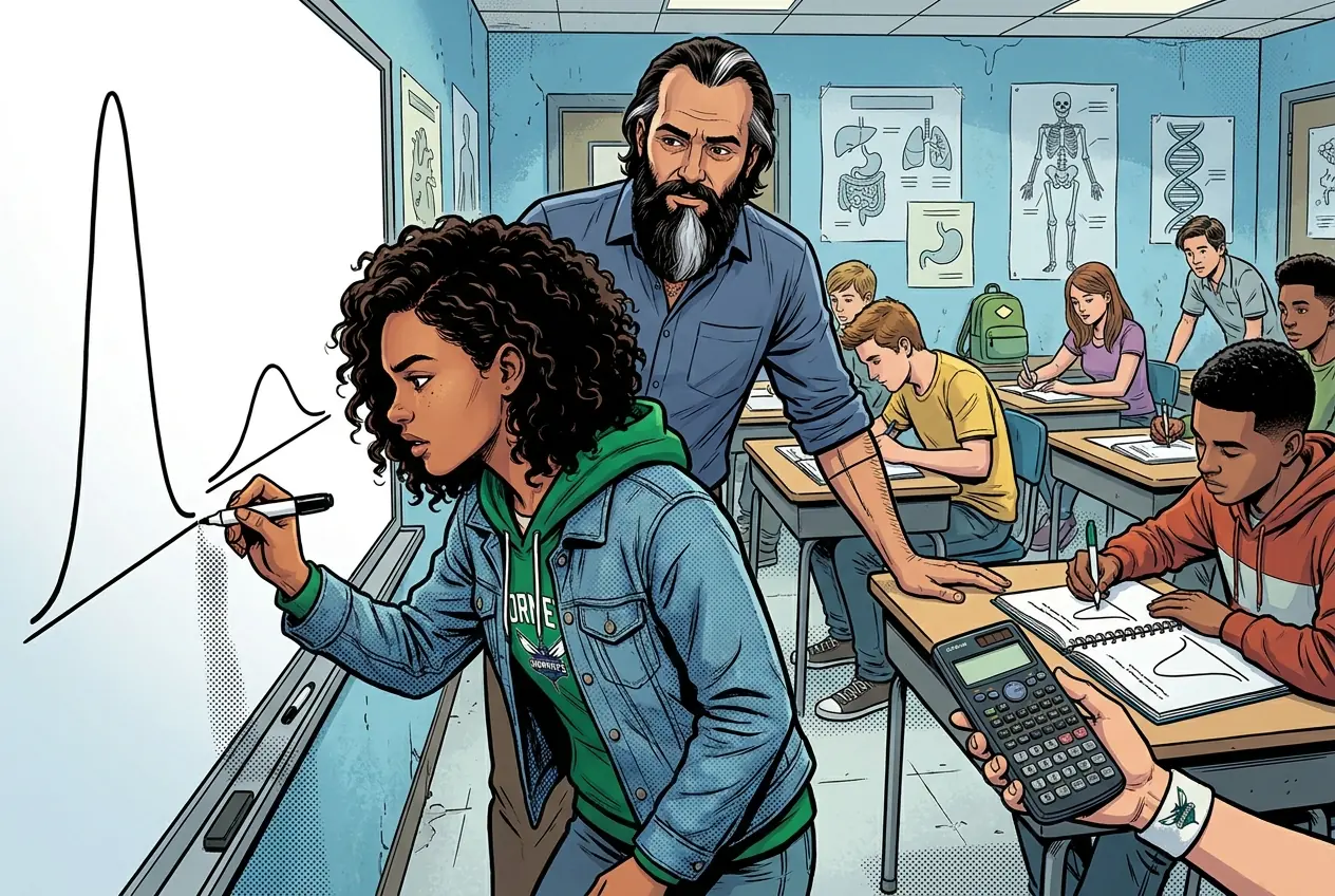
Two data sets, same average, completely different stories. The spread is what gave it away. I had never thought of standard deviation as anything but a formula.
Fiction. There is no such student. The lessons, labs and dates are the real planned course; the student, the classmates and the conversations are invented.
🛠 Get unstuck · pick your level
Lab day: Tier 1 is the whole class at the bench. No extension today.
🔑 Today's words · 5
Tap a word in the lesson for a plain meaning and one example. Recycled into next week's Do-Now.
Do the work · 80-minute blockfirst 5 min = hook▸
💡 Big idea: and a well-labeled graph turn raw measurements into evidence a scientist can defend.
- 0:00Quick-write: what is the difference between accuracy and precision? Share out
- 0:10Direct instruction: mean, median, range, , worked example with real numbers
- 0:28Students calculate all four statistics for their Wednesday data; check with a partner
- 0:42Graph construction: choose graph type, set labeled axes with units, plot data points
- 1:00CER writing: what does the spread (SD) say about precision in your measurement?
- 1:10Pair-share CERs; preview Friday submission checklist
- • You collected three measurements Wednesday. Three numbers on a page are not yet evidence. Today we turn those numbers into something a scientist or doctor could actually use.
- • In biomedical science, data without statistics is like a diagnosis without a reason. The tells us not just the answer, but how confident we should be in it.
- • We will practice calculating mean, median, range, and by hand first so you understand what the math is actually doing, then we will verify with a calculator.
- • Then we build the graph. A graph should tell the story of your data at a glance. We will learn what makes a graph trustworthy vs. misleading.
- • Mean, median, and range summarize a dataset's center and spread.
- • quantifies how much individual measurements scatter around the mean, revealing precision.
- • The choice of graph type (bar, line, scatter) depends on whether the is categorical or continuous.
Unit Course Launch: PLTW access, lab notebook, PPE/SDS, evidence handling, variables, controls, graphing, descriptive statistics. · Graphing and statistics
Day 4 of this lesson. Open this exact section in myPLTW (find it in Clever, Microsoft sign-in), then do the work below.
Do this: Open the launch unit in myPLTW and locate the data-analysis resource. Review any graphing or statistics guidance provided, then apply it to the data you collected Wednesday.
Mark the data-analysis review task complete in myPLTW.
You collected data Wednesday. By the end of today your , , and labeled graph should all be in your notebook.
Completed notebook page showing the , calculated statistics, and a labeled graph.
The official PLTW activity stays inside myPLTW. If myPLTW will not open, use F1 and E1-E3 on this page to complete today's local evidence decision, then make up the official activity when access returns. Turn this in at the drop folder with your district Microsoft sign-in, or hand it to Mr. Mendoza in class. Both count as submitted. Doing the activity in myPLTW does not.
Check things off as you work, then submit. This tells Mr. Mendoza how you're doing so he can help the class. It does not replace turning in your producible through the submission route shown below.
Use the code Mr. Mendoza gave you, not your name. Saved on this device.
Unit Course Launch: PLTW access, lab notebook, PPE/SDS, evidence handling, variables, controls, graphing, descriptive statistics. · Graphing and statistics
Open the launch unit in myPLTW and locate the data-analysis resource. Review any graphing or statistics guidance provided, then apply it to the data you collected Wednesday.
You collected data Wednesday. By the end of today your , , and labeled graph should all be in your notebook.
This is how Mr. Mendoza sees the class keeping pace with PLTW. Be honest, it only helps if it is accurate.
🎯 Build a graph from collected data and compute to summarize a sample.
- Enter Wednesday's measurements into a with labeled units.
- Calculate mean, median, range, and for your sample.
- Choose an appropriate graph type and plot the data with titled axes.
- Write a CER: what does the spread of data tell you about precision?
- Identify one limitation that the reveals about your method.
Data table: with three trials and units, calculations of mean/median/range/SD, a correctly labeled graph, and a 3-sentence CER explaining what the reveals about precision.
Turn this in at the drop folder with your district Microsoft sign-in, or hand it to Mr. Mendoza in class. Both count as submitted. Doing the activity in myPLTW does not. Use the checklist just below and upload by 11:29 PM for full credit. Absent with an excused absence? You get two school days for every day you were absent, so this deadline moves with you.
| Task | Who |
|---|---|
| Enter Wednesday's measurements into a with labeled units. | _______ |
| Calculate mean, median, range, and for your sample. | _______ |
| Choose an appropriate graph type and plot the data with titled axes. | _______ |
| Write a CER: what does the spread of data tell you about precision? | _______ |
| Identify one limitation that the reveals about your method. | _______ |
Working solo? Put your own name in "Who" for every row.
- I can compute mean, range, and .
- I can pick and label a graph that fits my data type.
- 1Do thisBuild a graph from collected data and compute descriptive statistics to summarize a sample.
- 2Use this resource
- 3Submit thisData table: Data table with three trials and units, calculations of mean/median/range/SD, a correctly labeled graph, and a 3-sentence CER explaining what the standard deviation reveals about precision.
- 4Submit it here
- 1Open the drop folder.
- 2Sign in with your district Microsoft account, not a personal one.
- 3Upload the file, named Lastname_Firstname__Assignment Title.
- 4Your own upload panel says Uploaded with a green check: that is your receipt.
Turn this in at the drop folder with your district Microsoft sign-in, or hand it to Mr. Mendoza in class. Both count as submitted. Doing the activity in myPLTW does not. Principles of Biomedical Technology (Principles of Biomedical Science) › Unit Course Launch: PLTW access, lab notebook, PPE/SDS, evidence handling, variables, controls, graphing, descriptive statistics. › Data tableOpen the drop folder
Learn it · deck, reading, and vocabulary▸
The deck carries the prior idea forward, lets you inspect an analogy, maps the rule to biology, and ends with the same evidence decision and exit ticket used on this page.
Generated from this lesson's canonical data with a red-team citation check.
Proper PPE and SDS literacy are non-negotiable prerequisites before anyone enters a biomedical lab.
and a well-labeled graph turn raw measurements into evidence a scientist can defend.
A detective board holds observations, possible explanations, and one next question.
- Which notes are direct observations?
- Which notes are explanations?
- What new evidence would separate the explanations?
Keep observations separate from explanations, then collect the evidence that can distinguish the options.
Biomedical investigations use controlled procedures and validated measurements, not intuition alone.
- • Board notes map to E1-E3.
- • Possible explanations map to the decision options.
- • The next question maps to the evidence-based action.
Driving question: You have thirty measurements and someone asks, so what does the data say? What do you compute and draw so your answer is defensible, not just an impression?
What you already know: Proper PPE and SDS literacy are non-negotiable prerequisites before anyone enters a biomedical lab.
New idea: and a well-labeled graph turn raw measurements into evidence a scientist can defend.
Visual or model: F1. F1. A lesson illustration or teaching diagram for Graphing and statistics. Use it with E1-E3; it is a model or context image, not experimental or patient data. What to notice: Trace the labeled observation or evidence sequence before choosing an explanation.
- Observe or measure the relevant feature in Graphing and statistics.
- Organize the observation with a stable evidence ID.
- Apply this rule: Keep observations separate from explanations, then collect the evidence that can distinguish the options.
- Choose the option the evidence supports and state the limit of the conclusion.
Real biomedical example: You have thirty measurements and someone asks, so what does the data say? What do you compute and draw so your answer is defensible, not just an impression?
What the evidence supports: E1-E3 and F1 support the daily take-home when the response meets the stated success criteria.
What it cannot prove: The package does not support claims beyond this lesson's or any real patient diagnosis.
- • : Practices and precautions that protect people from harm, such as wearing protective equipment and handling hazards correctly in a lab or clinic.
- • PPE: Personal protective equipment, the gear like gloves, goggles, lab coats, and masks worn to shield the body from chemical, biological, or physical hazards.
- • SDS: A data sheet: a standardized document listing a chemical's hazards, safe handling steps, and emergency measures for anyone using it.
- • variable: Any factor in an experiment that can change or be changed, including what you test, what you measure, and what you hold steady.
- • control: The comparison condition that isolates the effect of the variable being tested by keeping everything else the same.
- • evidence: The facts, data, and cases that carry your claim. Opinions are free; evidence costs homework.
- • : The documented record of who handled a piece of evidence, when, and where, proving it was never lost, swapped, or tampered with.
- • : Numbers and graphs, such as the mean, median, and range, that summarize and describe a set of data without drawing wider conclusions.
Use it now: Choose one decision option. Cite E1 and E3, then explain how the rule connects the evidence to your choice.
Go further, optional: The source links below are optional enrichment. Every fact required for today's local evidence decision appears in this lesson package.
Mean, median, and range summarize a dataset's center and spread.
Limit: E1 supplies context or an observation; it does not by itself establish the explanation.
and a well-labeled graph turn raw measurements into evidence a scientist can defend.
Limit: E2 is a teaching statement or comparison and must be checked against the task evidence.
I can compute mean, range, and .
Limit: E3 supports only the result or product criterion named here; it cannot justify a broader clinical or causal claim.
PLTW-PBT-2026-09-04 · Simulated classroom evidence scenario
Your role: biomedical investigator
Decision: Your team must decide what the evidence from Graphing and statistics supports before submitting the labeled and result claim named on the lesson page.
- • Select the option best supported by E1-E3.
- • Select a reasonable alternative and name the evidence it would require.
- • Delay the claim because the evidence does not distinguish the options.
Response: State one choice, cite at least two evidence IDs, explain the rule that connects them, and add one limitation. Submit it as the labeled and result claim.
Claim ceiling: The supplied lesson evidence can support an observation, pattern, classroom mechanism, or next-step decision about Graphing and statistics. It cannot by itself prove causation, establish a real clinical diagnosis, or justify action outside this classroom task.
Reason for review: Your team must decide what the evidence from Graphing and statistics supports before submitting the labeled and result claim named on the lesson page.
Context: and a well-labeled graph summarize a dataset's center, spread, and pattern, which is what lets you argue from data instead of from a hunch.
- • T1: Enter Wednesday's measurements into a with labeled units.
- • T2: Calculate mean, median, range, and for your sample.
- • T3: Choose an appropriate graph type and plot the data with titled axes.
- • T4: Write a CER: what does the spread of data tell you about precision?
- • T5: Identify one limitation that the reveals about your method.
- • E1: Mean, median, and range summarize a dataset's center and spread.
- • E2: and a well-labeled graph turn raw measurements into evidence a scientist can defend.
- • E3: I can compute mean, range, and .
Measurements: Use only the measurements, units, graph, or counts supplied in today's task. No additional patient measurement is implied.
Figure finding: Teaching diagram for Graphing and statistics. Trace the labeled observation or evidence sequence before choosing an explanation. This is a teaching model, not patient or experimental data.
Uncertainty: This is a composite classroom scenario. Missing history, measurements, or confirmation tests remain unknown and limit the conclusion.
Mean = sum of values / number of values. Median = middle ordered value. Range = maximum - minimum.
For 2, 4, 4, and 10: mean = 20 / 4 = 5, median = 4, and range = 10 - 2 = 8.
Mean, median, and range keep the measurement unit. Order the values before finding the median.
Calculate the requested summary for today's supplied values, then write what it reveals and what it hides.
Students often think the average (mean) tells you everything about a dataset. The trap: the mean hides the spread, so two datasets with the same mean can differ wildly; the range and are what reveal precision
I measured the resting heart rate of four classmates, three trials each, then summarized.
- Mean (Trial averages): 72 beats per minute
- Range: 84 minus 64 = 20 beats per minute
- Claim from the graph: heart rate varied most for Sample D, so I would re-check that person's measurements before trusting them.
My graph has the four samples on the x-axis (labeled 'Sample') and beats per minute on the y-axis (labeled 'Heart rate, bpm'), with a title 'Resting Heart Rate by Sample'. Every axis is labeled and has units, which is the SOP for a trustworthy figure.
| Sample | Trial 1 | Trial 2 | Trial 3 | Average |
|---|---|---|---|---|
| A | 70 | 72 | 71 | 71 |
| B | 65 | 64 | 66 | 65 |
| C | 83 | 84 | 82 | 83 |
| D | 68 | 76 | 72 | 72 |
This model shows the level of evidence and organization needed to complete: Completes the data-analysis launch task: a clean data table with the mean, range, and a labeled graph of your measurements.
- Name the variables and include units.
- Enter observations without changing the raw values.
- Check labels, calculations, and patterns before interpreting the data.
Keep the structure. Replace the question, facts, measurements, and evidence. Then recheck units, vocabulary, and whether the conclusion goes beyond the evidence.
Also due today: Save the labeled graph image to your notebook and write one sentence stating the mean and range in words.
- CER:
- Claim, Evidence, Reasoning: make a claim, back it with evidence, explain your reasoning.
- SOP:
- Standard Operating Procedure, the exact steps to follow (especially in a lab).
- Tracker:
- Your PLTW progress log where you record completed evidence.
- myPLTW:
- The PLTW course site where you do the online activities. Find it in Clever with your Microsoft sign-in, right next to Schoology.
Tap the speaker to hear a term. Add two of these to your notebook glossary with a definition and an example in your own words.
Pick just 2 or 3 words from today and make them yours: write what each one means in your own words, name the context clue or evidence that helped, then give one example from what you actually did in Graphing and statistics. Try your own words first; the glossary is there if you get stuck. This is voluntary and counts as extra credit, so keep it short.
Saved on this device. Show Mr. Mendoza or add these to your notebook glossary to claim the extra credit.
Hand-picked readings and interactives for this lesson, from authoritative open organizations and PLTW's own public course outline.
Check yourself · commit, then reveal▸
Claim ceiling for this check: The supplied lesson evidence can support an observation, pattern, classroom mechanism, or next-step decision about Graphing and statistics. It cannot by itself prove causation, establish a real clinical diagnosis, or justify action outside this classroom task.
Two samples have the same mean but very different standard deviations. What does that tell you, and which is more precise?
Write an answer and pick a confidence to unlock the key.
Fast retrieval with instant answers, not the commit-then-reveal check above. Try each from memory first: write what you remember about the earlier units, then check yourself here.
Go further and get help▸
I can name the procedure's purpose and the evidence I will record. I can identify each named hazard and the control that reduces it: Wear the required PPE, keep the bench clear, handle equipment only as directed, and know where the eyewash, sink, and spill kit are before you start. My data table is ready before materials are handled.
Finish the checklist before you handle any material.
- • Wear the required PPE, keep the bench clear, handle equipment only as directed, and know where the eyewash, sink, and spill kit are before you start.
- • Human samples and data stay private: label with a code, never a name, and dispose of materials in the correct waste container, then wash your hands.
- 1Before materials are handled, identify the purpose, variables or comparison, controls, measurement units, and stop-work condition.
- 2Enter Wednesday's measurements into a data table with labeled units.
- 3Calculate mean, median, range, and standard deviation for your sample.
- 4Choose an appropriate graph type and plot the data with titled axes.
- 5Write a CER: what does the spread of data tell you about precision?
- 6Identify one limitation that the standard deviation reveals about your method.
- 7Record each result in the prepared table before interpreting it. Mark missing, repeated, or invalid results truthfully.
- 8Complete the named cleanup and waste route, remove PPE safely, wash hands when required, and confirm the station is ready for the next group.
| Trial or sample ID | Independent condition | Measured result with units | Observation before interpretation | Quality-control note |
|---|---|---|---|---|
Before the procedure, predict the result and cite the rule behind the prediction.
After the procedure, compare the result with the prediction and name one limitation or source of uncertainty.
What today's skills lead to. These are real health-science careers this course builds toward. Tap one to see, on the US Department of Labor's O*NET site, what the job actually involves, what it pays, and how fast it is growing.
Today's work depends on equipment and locations in our lab, so it cannot be finished from home. Do the part that travels: read the target above and the safety notes, and write what you already know.
Back in class. The in-room part has to be done in the room. See Mr. Mendoza on your first day back and he will run it with you before you work at the bench.
Class still runs. Complete the online activity above (it's self-guided). Need the concept taught without a teacher? Use this authoritative explainer:
OSHA Hazard Communication Standard (SDS format)- CompleteEvery required part of the artifact is present, nothing left blank.
- AccurateThe science and the data are correct and match the evidence.
- Scientific reasoningYou explain your claim with evidence and reasoning (CER), not just an answer.
- Professional communicationClear, organized, labeled, and written the way a clinician or scientist would.
- SubmittedTurned in the right way, on the class site or handed to Mr. Mendoza in class, and confirmed. Not in Schoology: that is where the report-card grade appears later.
- Error analysis and method · counts doubleName a specific limit of the method and how it moved your result, and compare what you predicted to what happened. "Human error" does not count; say what about the procedure or instrument caused it.