
This class runs in two periods and they do not do the same lesson on the same day. You are reading the Period 6A-7B calendar, the one with John Carroll bioethics on Mondays.

Surge and usability notes
Do now
Students take notes on medical surge, mobile response facilities, and usability principles for public-health apps, then complete the PLTW online task.
- Hand in
- Annotated notes listing three usability principles with health-app examples, a sketch connecting user needs to a feature list, and one trust-building communication strategy.
- Where
- Submit this on the class form named on this page. The form requires the student's district Microsoft sign-in. The thank-you page is the submission receipt. A physical handoff counts only when the day page names that route. Doing the activity in myPLTW does not count as submitted.
You get two school days for every day you were absent, so this deadline moves with you.
If the form offers you a saved draft, choose New draft. If the Assignment box comes up empty, type it exactly: Surge and usability notes
A city pushes out a correct alert telling residents which mobile clinics are open, but half the people who open the app close it without finding the location. What about the design, not the facts, made a true message useless?
Students take notes on , mobile response facilities, and usability principles for public-health apps, then complete the PLTW online task.
- • Name three usability principles relevant to a health app.
- • Submit the PLTW online task fully completed.
- Name one app you gave up on because it was confusing, and what stopped you.
- If a health alert took four taps to reach, would most people finish? Why or why not?
- 1Annotate notes on medical-surge planning and mobile facility design.
- 2List the core usability principles for a public-facing health app.
- 3Connect clear public-health communication to user trust and uptake.
- 4Sketch how user needs drive an app feature list.
- 5Complete the assigned PLTW online activity on surge response and design.
The same day, drawn.

Public health communication fails when the message is accurate but the delivery is unusable.
Fiction. There is no such student. The lessons, labs and dates are the real planned course; the student, the classmates and the conversations are invented.
🛠 Get unstuck · pick your level
🔑 Today's words · 5
Tap a word in the lesson for a plain meaning and one example. Recycled into next week's Do-Now.
Check you have the right sheet: the top of it prints today's portal day, Surge and usability notes. The PLTW activity itself is in myPLTW and is not posted here.
Do the work · 80-minute blockfirst 5 min = hook▸
💡 Big idea: A public-health message reaches people only when the interface is usable, so accurate information in a bad interface fails because users abandon it before they act.
- 0-5 minWarm-up: name one app you use in an emergency and one thing that makes it fast to use.
- 5-28 minTeacher-led notes: medical-surge planning, mobile facility types, and deployment criteria.
- 28-45 minNotes: usability principles (learnability, efficiency, error tolerance, satisfaction) with health-app examples.
- 45-55 minConnect communication clarity to user trust; sketch how user needs produce a feature list.
- 55-75 minPLTW online activity on surge response and design (individual, self-paced).
- 75-80 minExit check: name three usability principles and one health-app example for each.
- • Wednesday your team designs a surge communication app: today's notes give you the principles to justify every design choice.
- • Usability is not aesthetics: it is whether a frightened person in a crisis can figure out the app in 10 seconds.
- • WebXam 072110 connects biotechnology and data handling to public-health communication tools.
- • Finish the PLTW activity today: the platform covers the same usability framework your Wednesday wireframe will use.
- • Mobile surge facilities require usability planning just as apps do: the target user's needs drive every design choice.
- • Core usability principles include learnability, efficiency, error tolerance, and satisfaction.
- • User trust in a public-health app depends on clear language, reliable updates, and minimal cognitive load.
Unit 3.2 to 3.3: Medical surge, mobile response facility, public-health communication, app design concept. · Surge and usability notes
Day 2 of this lesson. Open this exact section in myPLTW (find it in Clever, Microsoft sign-in), then do the work below.
Do this: In myPLTW, open Lesson 3.3 Information Sharing and go to Activity 3.3.1 User-centered Design.
Mark Activity 3.3.1 User-centered Design complete in myPLTW before the end of the period.
You started Activity 3.2.5 on Monday. Today finish Activity 3.3.1 User-centered Design so Thursday's design project uses the same principles.
Show completion confirmation to teacher before leaving.
The official PLTW activity stays inside myPLTW. If myPLTW will not open, use F1 and E1-E3 on this page to complete today's local evidence decision, then make up the official activity when access returns. Submit this on the class form named on this page. The form requires the student's district Microsoft sign-in. The thank-you page is the submission receipt. A physical handoff counts only when the day page names that route. Doing the activity in myPLTW does not count as submitted.
Check things off as you work, then submit. This tells Mr. Mendoza how you're doing so he can help the class. It does not replace turning in your producible through the submission route shown below.
Use the code Mr. Mendoza gave you, not your name. Saved on this device.
Unit 3.2 to 3.3: Medical surge, mobile response facility, public-health communication, app design concept. · Surge and usability notes
In myPLTW, open Lesson 3.3 Information Sharing and go to Activity 3.3.1 User-centered Design.
You started Activity 3.2.5 on Monday. Today finish Activity 3.3.1 User-centered Design so Thursday's design project uses the same principles.
This is how Mr. Mendoza sees the class keeping pace with PLTW. Be honest, it only helps if it is accurate.
🎯 Students take notes on , mobile response facilities, and usability principles for public-health apps, then complete the PLTW online task.
- Annotate notes on medical-surge planning and mobile facility design.
- List the core usability principles for a public-facing health app.
- Connect clear public-health communication to user trust and uptake.
- Sketch how user needs drive an app feature list.
- Complete the assigned PLTW online activity on surge response and design.
Notebook check: Annotated notes listing three usability principles with health-app examples, a sketch connecting user needs to a feature list, and one trust-building communication strategy.
Submit this on the class form named on this page. The form requires the student's district Microsoft sign-in. The thank-you page is the submission receipt. A physical handoff counts only when the day page names that route. Doing the activity in myPLTW does not count as submitted. Use the checklist just below and upload by 11:29 PM for full credit. Absent with an excused absence? You get two school days for every day you were absent, so this deadline moves with you.
| Task | Who |
|---|---|
| Annotate notes on medical-surge planning and mobile facility design. | _______ |
| List the core usability principles for a public-facing health app. | _______ |
| Connect clear public-health communication to user trust and uptake. | _______ |
| Sketch how user needs drive an app feature list. | _______ |
| Complete the assigned PLTW online activity on surge response and design. | _______ |
Working solo? Put your own name in "Who" for every row.
- Name three usability principles relevant to a health app.
- Submit the PLTW online task fully completed.
- 1Do thisStudents take notes on medical surge, mobile response facilities, and usability principles for public-health apps, then complete the PLTW online task.
- 2Use this resource
- 3Submit thisNotebook check: Annotated notes listing three usability principles with health-app examples, a sketch connecting user needs to a feature list, and one trust-building communication strategy.
- 4Submit it here
- 1Open the form. It must say For students at the top: if it says For parents and guardians, press Back and pick I am the student.
- 2If it offers you a saved draft, choose New draft: an old draft brings back the old assignment.
- 3Sign in with your district Microsoft account, not a personal one.
- 4Check the Assignment box says today's assignment from this page, then pick your period and type your student ID, all nine digits.
- 5Attach your file and press Submit. The thank-you page is your receipt.
Submit this on the class form named on this page. The form requires the student's district Microsoft sign-in. The thank-you page is the submission receipt. A physical handoff counts only when the day page names that route. Doing the activity in myPLTW does not count as submitted. Principles of Biomedical Technology (Principles of Biomedical Science) › Unit 3.2 to 3.3: Medical surge, mobile response facility, public-health communication, app design concept. › Notebook checkTurn it in
Learn it · deck, reading, and vocabulary▸
The deck carries the prior idea forward, lets you inspect an analogy, maps the rule to biology, and ends with the same evidence decision and exit ticket used on this page.
Generated from this lesson's canonical data with a red-team citation check.
Where a community sends limited surge resources determines who gets care, so deployment location is an equity decision and not just a logistics one.
A public-health message reaches people only when the interface is usable, so accurate information in a bad interface fails because users abandon it before they act.
A detective board holds observations, possible explanations, and one next question.
- Which notes are direct observations?
- Which notes are explanations?
- What new evidence would separate the explanations?
Keep observations separate from explanations, then collect the evidence that can distinguish the options.
Biomedical investigations use controlled procedures and validated measurements, not intuition alone.
- • Board notes map to the signs, results and measurements you recorded.
- • Possible explanations map to the competing biological causes.
- • The next question maps to the test or observation that would separate them.
Driving question: A city pushes out a correct alert telling residents which mobile clinics are open, but half the people who open the app close it without finding the location. What about the design, not the facts, made a true message useless?
What you already know: Where a community sends limited surge resources determines who gets care, so deployment location is an equity decision and not just a logistics one.
New idea: A public-health message reaches people only when the interface is usable, so accurate information in a bad interface fails because users abandon it before they act.
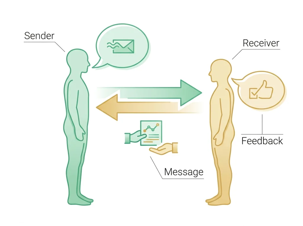
Visual or model: F1. F1. A lesson illustration or teaching diagram for Surge and usability notes. Use it with E1-E3; it is a model or context image, not experimental or patient data. What to notice: Use the labels and arrows in F1 to identify the relationship that supports Surge and usability notes.
- Observe or measure the relevant feature in today's lesson.
- Organize the observation with a stable evidence ID.
- Apply this rule: Keep observations separate from explanations, then collect the evidence that can distinguish the options.
- Choose the option the evidence supports and state the limit of the conclusion.
Real biomedical example: A city pushes out a correct alert telling residents which mobile clinics are open, but half the people who open the app close it without finding the location. What about the design, not the facts, made a true message useless?
What the evidence supports: E1-E3 and F1 support the daily take-home when the response meets the stated success criteria.
What it cannot prove: The package does not support claims beyond this lesson's or any real patient diagnosis.
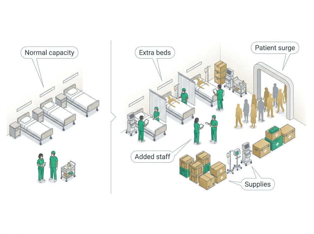
- • : A health system's ability to rapidly expand staff, beds, and supplies to handle a sudden jump in patients during an emergency or outbreak.
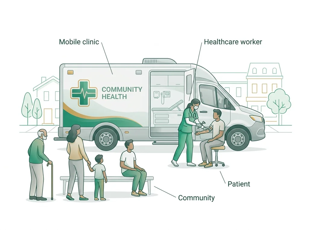
- • : Healthcare delivered to people where they are, using vehicles or portable units to reach communities far from a fixed clinic or hospital.
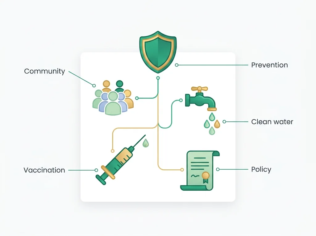
- • : The science of protecting and improving the health of whole communities through prevention, education, and policies rather than treating one patient at a time.
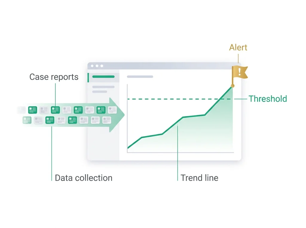
- • surveillance: The ongoing, systematic collection and analysis of health data to detect disease early, track its trends, and trigger a timely response.
- • communication: Sharing information clearly and accurately between people, which in healthcare keeps patients safe and helps teams coordinate care.
- • usability: Use the lesson context and glossary entry to explain usability in your own words.
Use it now: Choose one decision option. Cite E1 and E3, then explain how the rule connects the evidence to your choice.
Go further, optional: The source links below are optional enrichment. Every fact required for today's local evidence decision appears in this lesson package.
A biomedical design advances when test evidence is compared with explicit user needs, criteria, constraints, risks, and failure modes, then used to justify a documented revision.
Limit: A classroom prototype, , presentation, or does not establish clinical , effectiveness, manufacturing quality, or regulatory clearance.
Keep observations separate from explanations, then collect the evidence that can distinguish the options.
Limit: Biomedical investigations use controlled procedures and validated measurements, not intuition alone.
Name three usability principles relevant to a health app.
Limit: E3 defines the classroom product or success criterion. It is not independent scientific evidence and cannot justify a clinical or causal claim.
PLTW-PBT@P67-2026-12-03 · Simulated classroom evidence scenario
Your role: biomedical team member
Decision: Your team must decide what the evidence from today's lesson supports before submitting the notebook record named on the lesson page.
- • Select the option best supported by E1-E3.
- • Select a reasonable alternative and name the evidence it would require.
- • Delay the claim because the evidence does not distinguish the options.
Response: State one choice, cite at least two evidence IDs, explain the rule that connects them, and add one limitation. Submit it as the notebook record.
Claim ceiling: Today's evidence supports a classroom claim about today's lesson. It cannot prove causation, diagnose a real patient, or justify action outside this room.
Mean = sum of values / number of values. Median = middle ordered value. Range = maximum - minimum.
For 2, 4, 4, and 10: mean = 20 / 4 = 5, median = 4, and range = 10 - 2 = 8.
Mean, median, and range keep the measurement unit. Order the values before finding the median.
Calculate the requested summary for today's supplied values, then write what it reveals and what it hides.
- • The solution must address the stated need in today's lesson.
- • The decision must be supported by E1-E3.
- • The final product must make the success criteria visible.
- • Complete the work inside the 80-minute block.
- • Use only supplied or teacher-approved materials and evidence.
- • Do not trade , accessibility, or privacy for speed.
- • and evidence quality: must pass before scoring other criteria.
- • User need and effectiveness: highest scored criterion.
- • Time, cost, and ease of use: compare only after and effectiveness pass.
Test evidence: For each option, record the E1-E3 result that supports or fails each criterion. Do not assign a score without a named observation.
- Version or option tested
- Criterion met or missed
- Evidence ID and result
- Revision made
- Reason for the revision
- Need and user
- Criteria and constraints
- Chosen option and evidence
- Test result
- Revision and reason
Students often think Students believe that if the health information is accurate and complete, the communication has done its job and design is just decoration.. The trap: That is a trap, because a message only counts if a stressed person can actually find and act on it. In a surge people are scared and rushed, so a confusing interface loses them before the accurate content ever helps, which means usability is part of the message, not a coat of paint.
Three usability principles (with health-app examples):
- Learnability: a first-time user can figure it out fast. Example: a clear 'Find a clinic near me' button on the home screen.
- Efficiency: frequent tasks take few steps. Example: check wait times in one tap, not five.
- Error tolerance: mistakes are easy to recover from. Example: a confirmation step before submitting symptoms, with an 'edit' option.
(A fourth, satisfaction, means the experience feels trustworthy and not stressful.)
User needs drive features (sketch in words):
- User need: 'I do not know if it is safe to go to the ER.' -> Feature: live ER wait-time and capacity indicator.
- User need: 'I do not speak English well.' -> Feature: language toggle.
- User need: 'I have no data plan.' -> Feature: low-bandwidth text-only mode.
Trust-building strategy:
- Show the source and time of every update ('Updated 10 min ago by County Health'). People act on information they believe is current and official, which is critical during a surge.
This model shows the level of evidence and organization needed to complete: Completes the surge and design note-taking task: three usability principles with examples, a user-needs-to-feature sketch, and one trust-building strategy.
- Date and label the entry.
- Record the procedure, observation, or design decision clearly.
- End with what the evidence means and the next step.
Keep the structure. Replace the question, facts, measurements, and evidence. Then recheck units, vocabulary, and whether the conclusion goes beyond the evidence.
Also due today: Complete the assigned PLTW online activity on surge response and design, then keep your notes for the design project.
- CER:
- Claim, Evidence, Reasoning: make a claim, back it with evidence, explain your reasoning.
- SOP:
- Standard Operating Procedure, the exact steps to follow (especially in a lab).
- Tracker:
- Your PLTW progress log where you record completed evidence.
- myPLTW:
- The PLTW course site where you do the online activities. Find it in Clever with your Microsoft sign-in, right next to Schoology.
Tap the speaker to hear a term. Add two of these to your notebook glossary with a definition and an example in your own words.
Pick just 2 or 3 words from today and make them yours: write what each one means in your own words, name the context clue or evidence that helped, then give one example from what you actually did in Surge and usability notes. Try your own words first; the glossary is there if you get stuck. This is voluntary and counts as extra credit, so keep it short.
Saved on this device. Show Mr. Mendoza or add these to your notebook glossary to claim the extra credit.
Hand-picked readings and interactives for this lesson, from authoritative open organizations and PLTW's own public course outline.
Check yourself · commit, then reveal▸
Claim ceiling for this check: Today's evidence supports a classroom claim about today's lesson. It cannot prove causation, diagnose a real patient, or justify action outside this room.
A surge app is completely accurate but requires a login, three taps, and a scroll to reach the open-clinic list. Which usability principle is it failing most, and what would that cost in a surge?
Write an answer and pick a confidence to unlock the key.
Fast retrieval with instant answers, not the commit-then-reveal check above. Try each from memory first: write what you remember about the earlier units, then check yourself here.
Go further and get help▸
What today's skills lead to. These are real health-science careers this course builds toward. Tap one to see, on the US Department of Labor's O*NET site, what the job actually involves, what it pays, and how fast it is growing.
Today is individual work you can do from home: complete the same target above, then submit your Notebook check.
Turn it inSubmit this on the class form named on this page. The form requires the student's district Microsoft sign-in. The thank-you page is the submission receipt. A physical handoff counts only when the day page names that route. Doing the activity in myPLTW does not count as submitted.
Class still runs. Complete the online activity above (it's self-guided). Need the concept taught without a teacher? Use this authoritative explainer:
Ready.gov: pandemic and large-scale health emergenciesYou've passed Unit 2, so the optional extra-credit track is open. Complete reserved-unit work from home, including virtual labs, for extra credit. Each item shows its correct submission route.
Open the extra-credit track- CompleteEvery required part of the artifact is present, nothing left blank.
- AccurateThe science and the data are correct and match the evidence.
- Scientific reasoningYou explain your claim with evidence and reasoning (CER), not just an answer.
- Professional communicationClear, organized, labeled, and written the way a clinician or scientist would.
- SubmittedTurned in through the one route named under Submit here and confirmed by the form receipt or the named physical handoff. Not in Schoology: that is where the report-card grade appears later.