

Heat-map claim
Do now
Read a microarray heat map and write a claim that separates disease risk from disease diagnosis.
- Hand in
- Shaded heat map of four genes and a CER claim (claim, two fold-change values as evidence, reasoning) that distinguishes risk from diagnosis.
- Where
- Turn this in at the drop folder with your district Microsoft sign-in, or hand it to Mr. Mendoza in class. Both count as submitted. Doing the activity in myPLTW does not.
You get two school days for every day you were absent, so this deadline moves with you.
Looking at your own color-coded grid of fold-change values, which cluster of genes differs most between diseased and healthy, and does that pattern let you say a patient has the disease or only that they are at elevated risk?
Read a heat map and write a claim that separates disease risk from disease diagnosis.
- • You'll be able to read clusters on a heat map.
- • You'll be able to distinguish risk from diagnosis in your claim.
- On a heat map, if bright red means a gene is highly , what would you expect the same gene to look like in the healthy sample where it is barely active?
- In your own words, what is the difference between saying a patient is at risk for a disease and saying a patient has the disease?
- 1Shade your fold-change values from Wednesday into a small heat map, high values one color and low another.
- 2Identify the cluster of genes that differs most between diseased and healthy samples.
- 3Write a CER claim about what the pattern suggests, with two values as evidence.
- 4Add one sentence explaining why this pattern shows risk, not a confirmed diagnosis.
- 5Submit your heat map and claim as your daily evidence.
What did this day actually feel like?
Heat-map claim
Reading a heat map, where colour is intensity and the pattern is the finding. Red up, green down, clustered so similar things sit together.
I made a claim off a striking colour block that turned out to be three genes, which is not a pattern, it is a coincidence with good graphic design.
Turned in: CER → Claim Evidence Reasoning folder
Fiction. There is no such student. The lessons, labs and dates are the real planned course; the student, the classmates and the conversations are invented.
The same day, drawn.
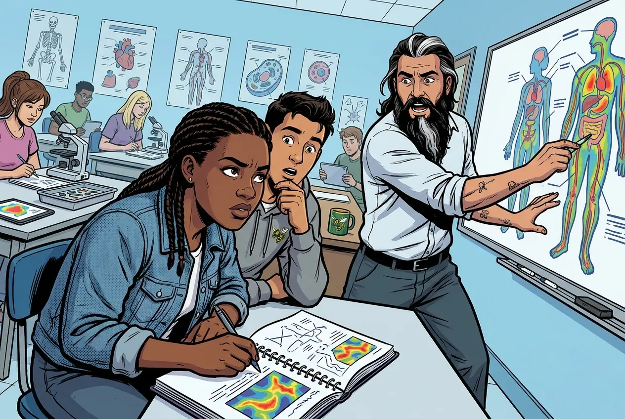
Reading a heat map, where colour is intensity and the pattern is the finding. Red up, green down, clustered so similar things sit together.
MR. MENDOZA
Three genes is not a pattern. It is a coincidence with good graphic design.
Fiction. There is no such student. The lessons, labs and dates are the real planned course; the student, the classmates and the conversations are invented.
🛠 Get unstuck · pick your level
🔑 Today's words · 5
Tap a word in the lesson for a plain meaning and one example. Recycled into next week's Do-Now.
Do the work · 80-minute blockfirst 5 min = hook▸
💡 Big idea: A heat map encodes fold-change magnitude as color, so it can reveal an elevated-risk pattern, but because expression alone is not clinical confirmation, that pattern signals risk rather than a diagnosis.
- 0-8Hook heat maps; review risk vs. diagnosis distinction
- 8-25Shade fold-change values from Wednesday into heat map grid (high = one color, low = another)
- 25-45Identify the gene cluster with the greatest diseased-vs.-healthy difference
- 45-60Write CER claim using two specific fold-change values as evidence
- 60-72Add risk-vs.-diagnosis sentence; peer check for accuracy
- 72-80Submit heat map and claim to the class site; preview Friday report
- • Hook: Show two heat maps: one from a healthy subject, one from a diagnosed patient, and ask students to point to the biggest difference.
- • Why it matters: Clinicians use expression clusters to decide which patients need follow-up biopsies or monitoring.
- • Today's work: You shade your own data into a heat map and write the claim a clinician would write, carefully distinguishing risk from diagnosis.
- • Exit goal: Heat map and CER claim submitted before the bell.
- • A heat map encodes fold-change magnitude as color intensity; clustering similar patterns reveals co-regulated gene groups.
- • A risk indicator shows an elevated probability of disease; a diagnosis requires clinical confirmation beyond expression data alone.
- • CER claims from data should be falsifiable: if the expression pattern reversed, what would that mean for your claim?
Differential expression, fold change, correlation, disease risk vs. diagnosis. · Heat-map claim
Day 2 of this lesson. Open this exact section in myPLTW (find it in Clever, Microsoft sign-in), then do the work below.
Do this: Open Activity 3.1.4 DNA in myPLTW and shade your fold-change values into a heat map to identify the gene cluster with the greatest difference.
Mark the heat-map activity complete after your heat map and CER claim are submitted.
Fold-change table should be done (Wednesday); heat map and CER claim due today.
Shaded heat map and CER claim distinguishing risk from diagnosis submitted.
The official PLTW activity stays inside myPLTW. If myPLTW will not open, use F1 and E1-E3 on this page to complete today's local evidence decision, then make up the official activity when access returns. Turn this in at the drop folder with your district Microsoft sign-in, or hand it to Mr. Mendoza in class. Both count as submitted. Doing the activity in myPLTW does not.
Check things off as you work, then submit. This tells Mr. Mendoza how you're doing so he can help the class. It does not replace turning in your producible through the submission route shown below.
Use the code Mr. Mendoza gave you, not your name. Saved on this device.
Differential expression, fold change, correlation, disease risk vs. diagnosis. · Heat-map claim
Open Activity 3.1.4 DNA in myPLTW and shade your fold-change values into a heat map to identify the gene cluster with the greatest difference.
Fold-change table should be done (Wednesday); heat map and CER claim due today.
This is how Mr. Mendoza sees the class keeping pace with PLTW. Be honest, it only helps if it is accurate.
🎯 Read a heat map and write a claim that separates disease risk from disease diagnosis.
- Shade your fold-change values from Wednesday into a small heat map, high values one color and low another.
- Identify the cluster of genes that differs most between diseased and healthy samples.
- Write a CER claim about what the pattern suggests, with two values as evidence.
- Add one sentence explaining why this pattern shows risk, not a confirmed diagnosis.
- Submit your heat map and claim as your daily evidence.
CER: Shaded heat map of four genes and a CER claim (claim, two fold-change values as evidence, reasoning) that distinguishes risk from diagnosis.
Turn this in at the drop folder with your district Microsoft sign-in, or hand it to Mr. Mendoza in class. Both count as submitted. Doing the activity in myPLTW does not. Use the checklist just below and upload by 11:29 PM for full credit. Absent with an excused absence? You get two school days for every day you were absent, so this deadline moves with you.
| Task | Who |
|---|---|
| Shade your fold-change values from Wednesday into a small heat map, high values one color and low another. | _______ |
| Identify the cluster of genes that differs most between diseased and healthy samples. | _______ |
| Write a CER claim about what the pattern suggests, with two values as evidence. | _______ |
| Add one sentence explaining why this pattern shows risk, not a confirmed diagnosis. | _______ |
| Submit your heat map and claim as your daily evidence. | _______ |
Working solo? Put your own name in "Who" for every row.
- You'll be able to read clusters on a heat map.
- You'll be able to distinguish risk from diagnosis in your claim.
- 1Do thisRead a microarray heat map and write a claim that separates disease risk from disease diagnosis.
- 2Use this resource
- 3Submit thisCER: Shaded heat map of four genes and a CER claim (claim, two fold-change values as evidence, reasoning) that distinguishes risk from diagnosis.
- 4Submit it here
- 1Open the drop folder.
- 2Sign in with your district Microsoft account, not a personal one.
- 3Upload the file, named Lastname_Firstname__Assignment Title.
- 4Your own upload panel says Uploaded with a green check: that is your receipt.
Turn this in at the drop folder with your district Microsoft sign-in, or hand it to Mr. Mendoza in class. Both count as submitted. Doing the activity in myPLTW does not. Genetics of Disease (Medical Interventions) › Differential expression, fold change, correlation, disease risk vs. diagnosis. › CEROpen the drop folder
Learn it · deck, reading, and vocabulary▸
The deck carries the prior idea forward, lets you inspect an analogy, maps the rule to biology, and ends with the same evidence decision and exit ticket used on this page.
Generated from this lesson's canonical data with a red-team citation check.
Fold change divides diseased expression by healthy expression, so a result above 1 means the disease turned a gene up and a result below 1 means it turned the gene down.
A heat map encodes fold-change magnitude as color, so it can reveal an elevated-risk pattern, but because expression alone is not clinical confirmation, that pattern signals risk rather than a diagnosis.
A library keeps a master plan protected while working copies guide production at different stations.
- Why protect the master copy?
- What information moves?
- Where can an error change the final product?
Stored information can be copied, read, and converted into a functional product.
Genes are regulated biological sequences, not conscious instructions, and one gene rarely determines a whole trait alone.
- • Master plan maps to DNA.
- • Working copy maps to RNA.
- • Production output maps to or a regulated cell function.
Driving question: Looking at your own color-coded grid of fold-change values, which cluster of genes differs most between diseased and healthy, and does that pattern let you say a patient has the disease or only that they are at elevated risk?
What you already know: Fold change divides diseased expression by healthy expression, so a result above 1 means the disease turned a gene up and a result below 1 means it turned the gene down.
New idea: A heat map encodes fold-change magnitude as color, so it can reveal an elevated-risk pattern, but because expression alone is not clinical confirmation, that pattern signals risk rather than a diagnosis.
Visual or model: F1. F1. A lesson illustration or teaching diagram for Heat-map claim. Use it with E1-E3; it is a model or context image, not experimental or patient data. What to notice: Trace the labeled testing, treatment, or biological process and identify where evidence limits the decision.
- Observe or measure the relevant feature in Heat-map claim.
- Organize the observation with a stable evidence ID.
- Apply this rule: Stored information can be copied, read, and converted into a functional product.
- Choose the option the evidence supports and state the limit of the conclusion.
Real biomedical example: Looking at your own color-coded grid of fold-change values, which cluster of genes differs most between diseased and healthy, and does that pattern let you say a patient has the disease or only that they are at elevated risk?
What the evidence supports: E1-E3 and F1 support the daily take-home when the response meets the stated success criteria.
What it cannot prove: The package does not support claims beyond this lesson's or any real patient diagnosis.
- • : The process by which the information in a gene is used to build a working product, usually a , through and .
- • mRNA: Messenger RNA, the single-stranded copy of a gene that carries instructions from the DNA in the to the ribosome to build a .
- • : Describing a gene or that the cell is making in larger amounts than usual, often in response to a signal or change in conditions.
- • : Describes a gene or whose activity or amount has been turned down, so the cell makes less of its product.
- • correlation: Two things tending to occur together, which does not by itself prove that one causes the other.
- • risk: The chance that a harmful event, such as getting a disease, will happen within a given group or time period.
- • diagnosis: The process of identifying a disease or condition by examining symptoms, history, and test results to explain what is wrong.
Use it now: Choose one decision option. Cite E1 and E3, then explain how the rule connects the evidence to your choice.
Go further, optional: The source links below are optional enrichment. Every fact required for today's local evidence decision appears in this lesson package.
A heat map encodes fold-change magnitude as color intensity; clustering similar patterns reveals co-regulated gene groups.
Limit: E1 supplies context or an observation; it does not by itself establish the explanation.
A heat map encodes fold-change magnitude as color, so it can reveal an elevated-risk pattern, but because expression alone is not clinical confirmation, that pattern signals risk rather than a diagnosis.
Limit: E2 is a teaching statement or comparison and must be checked against the task evidence.
You'll be able to read clusters on a heat map.
Limit: E3 supports only the result or product criterion named here; it cannot justify a broader clinical or causal claim.
PLTW-GEND-2026-10-22 · Simulated classroom evidence scenario
Your role: medical interventions team member
Decision: Your team must decide what the evidence from Heat-map claim supports before submitting the claim-evidence-reasoning response named on the lesson page.
- • Choose the strongest supported explanation.
- • Choose the next evidence to collect.
- • Hold the decision because the evidence is insufficient.
Response: State one choice, cite at least two evidence IDs, explain the rule that connects them, and add one limitation. Submit it as the claim-evidence-reasoning response.
Claim ceiling: The supplied lesson evidence can support an observation, pattern, classroom mechanism, or next-step decision about Heat-map claim. It cannot by itself prove causation, establish a real clinical diagnosis, or justify action outside this classroom task.
Reason for review: Your team must decide what the evidence from Heat-map claim supports before submitting the claim-evidence-reasoning response named on the lesson page.
Context: Data can shift the odds without settling the verdict, so a strong expression pattern is a reason to look harder, not a finished diagnosis.
- • T1: Shade your fold-change values from Wednesday into a small heat map, high values one color and low another.
- • T2: Identify the cluster of genes that differs most between diseased and healthy samples.
- • T3: Write a CER claim about what the pattern suggests, with two values as evidence.
- • T4: Add one sentence explaining why this pattern shows risk, not a confirmed diagnosis.
- • T5: Submit your heat map and claim as your daily evidence.
- • E1: A heat map encodes fold-change magnitude as color intensity; clustering similar patterns reveals co-regulated gene groups.
- • E2: A heat map encodes fold-change magnitude as color, so it can reveal an elevated-risk pattern, but because expression alone is not clinical confirmation, that pattern signals risk rather than a diagnosis.
- • E3: You'll be able to read clusters on a heat map.
Measurements: Use only the measurements, units, graph, or counts supplied in today's task. No additional patient measurement is implied.
Figure finding: Teaching diagram for Heat-map claim. Trace the labeled testing, treatment, or biological process and identify where evidence limits the decision. This is a teaching model, not patient or experimental data.
Uncertainty: This is a composite classroom scenario. Missing history, measurements, or confirmation tests remain unknown and limit the conclusion.
Mean = sum of values / number of values. Median = middle ordered value. Range = maximum - minimum.
For 2, 4, 4, and 10: mean = 20 / 4 = 5, median = 4, and range = 10 - 2 = 8.
Mean, median, and range keep the measurement unit. Order the values before finding the median.
Calculate the requested summary for today's supplied values, then write what it reveals and what it hides.
Students often think Students believe that a striking heat-map pattern is itself proof that the patient has the disease.. The trap: A heat map shows expression differences, and expression can be elevated for many reasons, so the pattern raises the probability of disease but does not confirm it. Calling risk a diagnosis is a trap because it skips the clinical confirmation a real patient still needs.
Note: This is a parallel model on a different case (a newborn metabolic screening panel), not the heat-map task you are doing today. Use it to see the CER format and depth, then build your own claim from your own grid.\n\nI shaded four screening values from a newborn blood-spot panel into a small strip, using a darker color for values above the reference cutoff and a lighter color for values below it.\n\nClaim: The pattern in this sample suggests an elevated risk of phenylketonuria, especially in the raised amino-acid values, but it does not confirm the condition.\n\nEvidence: The phenylalanine level is 6 mg/dL and the phenylalanine-to-tyrosine ratio is 3.5, both above the standard screening cutoffs, which matches the pattern flagged for follow-up in the reference.\n\nWhy this is risk, not diagnosis: A screening panel is designed to catch samples that need a closer look, so an above-cutoff result raises the probability of the condition rather than proving it. Some raised values come from feeding timing, prematurity, or lab handling, so a confirmatory test such as a plasma amino-acid analysis or a genetic test is needed before anyone can say the newborn has the disorder. For that reason my claim names risk and points to follow-up, not a confirmed diagnosis.\n\nFalsifiability check: If a confirmatory plasma amino-acid test came back within the normal range, the risk signal would be explained as a false positive and my claim would be wrong, which shows the claim is testable.
| Gene | Fold change | Heat-map shade |
|---|---|---|
| Gene 3 | 4.0 | darkest |
| Gene 1 | 3.2 | dark |
| Gene 4 | 0.5 | light |
| Gene 2 | 0.25 | lightest |
This model shows the level of evidence and organization needed to complete: Parallel worked CER: a shaded results strip for a newborn screening panel and a claim with two numeric values as evidence that separates screening risk from diagnosis. Models the format only. Your own heat-map claim is different.
- Write one defensible claim.
- Choose specific evidence that supports the claim.
- Explain the scientific rule that connects the evidence to the claim.
Keep the structure. Replace the question, facts, measurements, and evidence. Then recheck units, vocabulary, and whether the conclusion goes beyond the evidence.
Also due today: Submit your heat map and claim to the class site.
- CER:
- Claim, Evidence, Reasoning: make a claim, back it with evidence, explain your reasoning.
- SOP:
- Standard Operating Procedure, the exact steps to follow (especially in a lab).
- Tracker:
- Your PLTW progress log where you record completed evidence.
- myPLTW:
- The PLTW course site where you do the online activities. Find it in Clever with your Microsoft sign-in, right next to Schoology.
Tap the speaker to hear a term. Add two of these to your notebook glossary with a definition and an example in your own words.
Pick just 2 or 3 words from today and make them yours: write what each one means in your own words, name the context clue or evidence that helped, then give one example from what you actually did in Heat-map claim. Try your own words first; the glossary is there if you get stuck. This is voluntary and counts as extra credit, so keep it short.
Saved on this device. Show Mr. Mendoza or add these to your notebook glossary to claim the extra credit.
Classroom documents for this lesson are posted in Schoology. Open Clever, then Schoology, and find each one by the name shown on its card.
Use this as the classroom resource for and analysis.
Placement rationale
Matched and analysis by path:Medical-Interventions/Unit-2_How-to-Screen-Your-Genes/00_Unit-Overview; keywords:gene expression, microarray. Score 138. Visibility: student-schoology (student-facing resource; link through Schoology rather than local path).
Use this if you were absent, got stuck, or need another pass before you submit the lesson artifact.
Placement rationale
Matched and analysis by path:Medical-Interventions/Unit-2_How-to-Screen-Your-Genes/00_Unit-Overview; keywords:microarray. Score 126. Visibility: student-schoology (student-facing resource; link through Schoology rather than local path).
Use this if you were absent, got stuck, or need another pass before you submit the lesson artifact.
Placement rationale
Matched and analysis by path:Medical-Interventions/Unit-2_How-to-Screen-Your-Genes/2.1_Genetic-Testing-and-Screening. Score 126. Visibility: student-schoology (student-facing resource; link through Schoology rather than local path).
How to get there: open Clever and sign in with your Microsoft (district) account. Both myPLTW and Schoology are in Clever. Do the activity in myPLTW. Turn the work in on this site or hand it to Mr. Mendoza, because that is the step that counts as submitted. Schoology only shows your report-card grade later.
Check yourself · commit, then reveal▸
Claim ceiling for this check: The supplied lesson evidence can support an observation, pattern, classroom mechanism, or next-step decision about Heat-map claim. It cannot by itself prove causation, establish a real clinical diagnosis, or justify action outside this classroom task.
Your heat map shows a bright cluster of upregulated genes in the diseased sample. A classmate writes: 'This proves the patient has the disease.' Fix the claim so it is scientifically honest.
Write an answer and pick a confidence to unlock the key.
Fast retrieval with instant answers, not the commit-then-reveal check above. Try each from memory first: write what you remember about the earlier units, then check yourself here.
Go further and get help▸
What today's skills lead to. These are real health-science careers this course builds toward. Tap one to see, on the US Department of Labor's O*NET site, what the job actually involves, what it pays, and how fast it is growing.
Follow IRF6 from gene to , and see why the lip and need it.
Goes with: From gene to protein: IRF6 has a job
Five genes, five ways to interrupt a face: IRF6, , CDH3, MSX1, .
Goes with: The cleft gene set: more than one way to interrupt a face
Today is individual work you can do from home: complete the same target above, then submit your CER.
Open the drop folderTurn this in at the drop folder with your district Microsoft sign-in, or hand it to Mr. Mendoza in class. Both count as submitted. Doing the activity in myPLTW does not.
Class still runs. Complete the online activity above (it's self-guided). Need the concept taught without a teacher? Use this authoritative explainer:
Genetic Science Learning Center: Genes and gene expression- CompleteEvery required part of the artifact is present, nothing left blank.
- AccurateThe science and the data are correct and match the evidence.
- Scientific reasoningYou explain your claim with evidence and reasoning (CER), not just an answer.
- Professional communicationClear, organized, labeled, and written the way a clinician or scientist would.
- SubmittedTurned in the right way, on the class site or handed to Mr. Mendoza in class, and confirmed. Not in Schoology: that is where the report-card grade appears later.